A large catalogue can make a site feel like a warehouse. Every category, product, price, and button is useful on its own, but the whole page can still leave a new visitor asking, “Where do I begin?”
Start with the reason people came
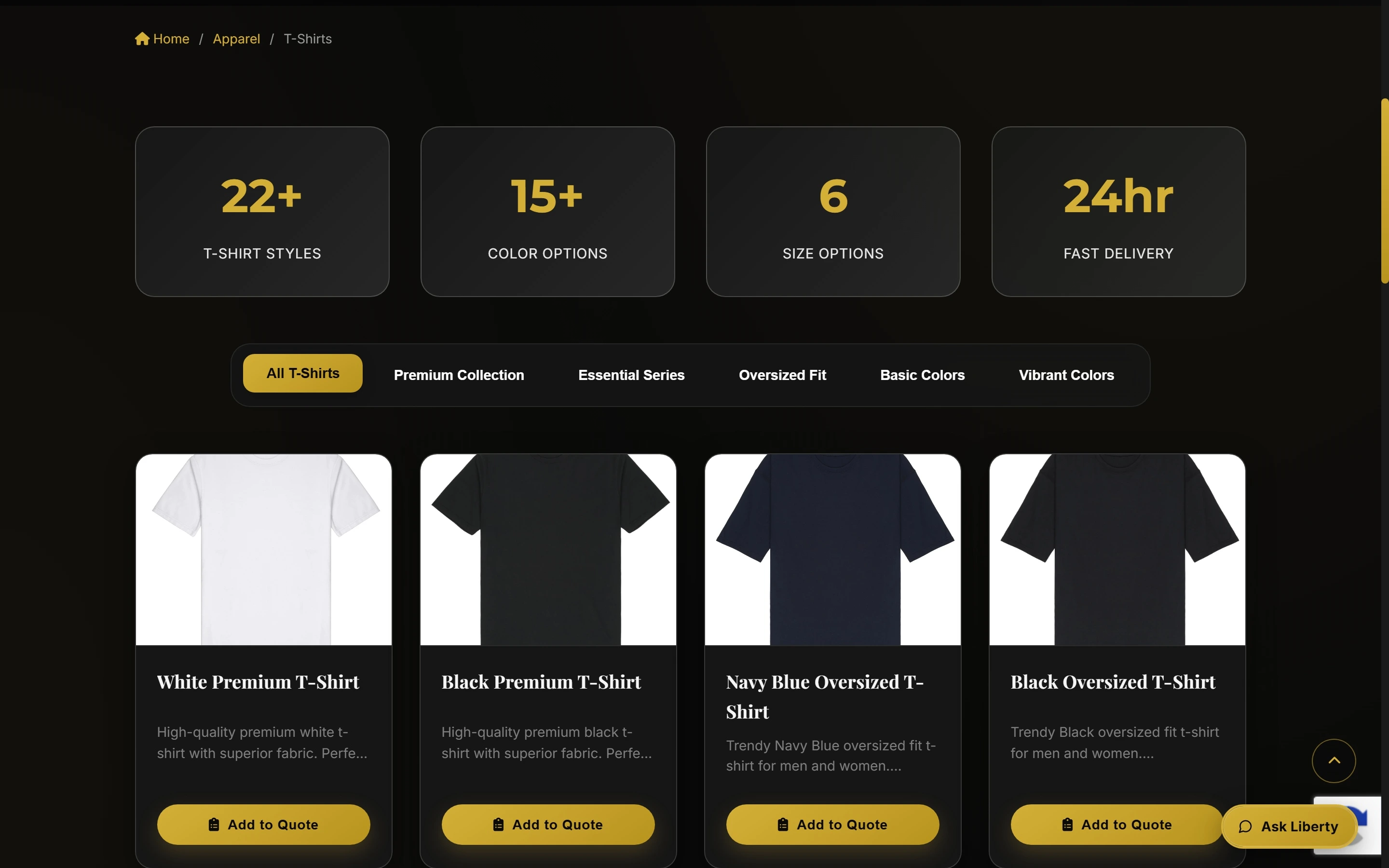
Liberty Digitizing serves more than one kind of customer. Someone may be choosing apparel, ordering patches, or asking for embroidery and vector work. Those are different jobs, so they should have different starting points instead of one large list.
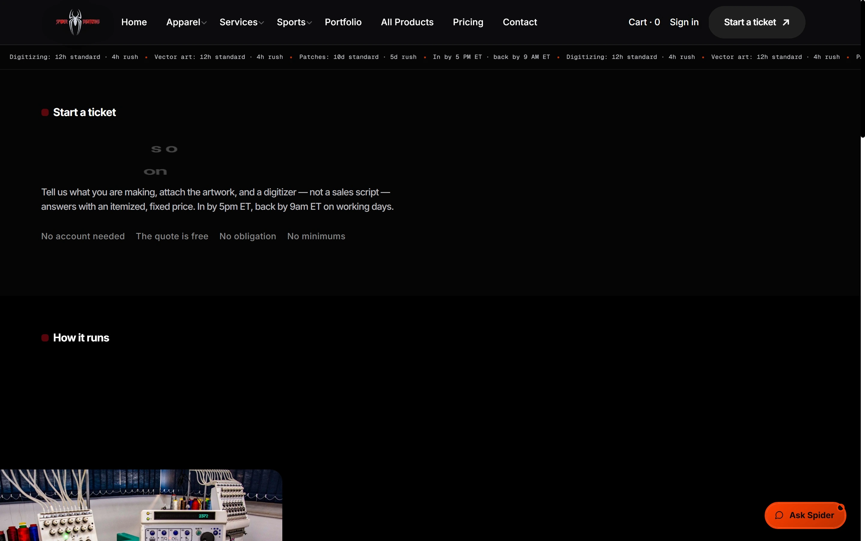
Digitizing Depot has a similar problem. Its offer includes products, digitizing, vector work, and other services. A service family, a useful example, and a clear next action help a visitor narrow the question before they reach the form.
Keep the story and the action together
For TY Dress Collection, the collection is part of the reason someone wants to look. The page can create a fashion mood, but it still needs to show the piece, price, variant, availability, bag, and checkout path. Editorial presentation and commerce do not need to fight each other; they need to hand the visitor from one to the next.
For a B2B buyer at Affinity Hospitality UAE, the useful detail is different again. Material, size, branding, and delivery context may matter more than a broad slogan. The right catalogue helps the buyer assemble a brief that can become a real enquiry.
A simple catalogue check
Pick a product or service you have never seen before. Can you tell what the business offers, which part is for you, and what to do next without opening every page? If not, the catalogue needs a better order, not more decoration.
The job of a catalogue is to reduce the first decision. Once someone has a sensible starting point, the deeper details can do their work.